by James Dean | Feb 23, 2024 | Blogs
Crafting an Effective Landing Page: A Comprehensive Guide

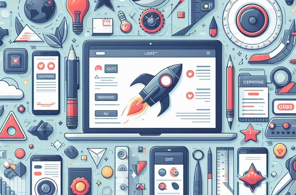
In today’s digital landscape, a captivating landing page is indispensable for online success. Whether your goal is to capture leads, promote a product, or convey a compelling message, the effectiveness of your landing page can significantly impact your outcomes. Let’s delve into what constitutes a remarkable landing page and how you can design one that not only grabs attention but also converts visitors into engaged customers or subscribers.
Introduction: Understanding the Significance of Landing Pages
In the vast realm of web design, a landing page serves as your canvas for storytelling, a stage for showcasing brand personality, and a tool for driving results. It is meticulously crafted with a specific purpose: to guide visitors toward a predetermined action. Unlike pages within the main website’s navigation, a landing page stands alone, finely tuned to achieve a particular goal, be it capturing leads, promoting products, securing webinar sign-ups, or encouraging app downloads.
Defining a Landing Page: Purpose and Functionality
1. Primary Objective Clarity:
Start by defining the primary purpose of your landing page. Whether it’s prompting visitors to fill out a form, make a purchase, or download an e-book, a clear objective is paramount.
2. Audience Understanding:
Tailor your design and messaging to resonate with your target audience’s preferences, pain points, and needs. Personalization is key to effective branding.
3. Compelling Headline Creation:
Craft an attention-grabbing headline that clearly communicates the value proposition of your offer. The headline serves as the initial hook for visitors, so make it impactful.
4. Clear Call to Action (CTA):
Design a prominent CTA button with action-oriented text such as “Sign Up Now,” “Get Started,” or “Buy Now.” Ensure it stands out visually and is easily accessible.
Designing Process: Key Steps and Considerations
1. Choosing the Right Tools:
Utilize tools like WordPress page builders or pre-designed templates to streamline the design process. These tools offer flexibility and efficiency in creating visually appealing landing pages.
2. Mobile Responsiveness:
Optimize your landing page for mobile devices to ensure seamless functionality and a positive user experience across various screen sizes. Consulting web design services can help ensure mobile responsiveness and enhance search engine rankings.
3. Integration of Tracking and Analytics:
Implement analytics tools to monitor user behavior, conversion rates, and other important metrics. Leverage data insights to refine and optimize your landing page’s performance over time.
Key Elements of Effective Landing Page Design
1. Color Scheme and Visual Hierarchy: Choose a color scheme that aligns with your brand identity and guides the visitor’s eye to essential elements such as the headline and CTA. Utilize contrasting colors to make key information stand out.
2. Typography: Select legible fonts that enhance readability and establish a visual hierarchy. Consistency in typography reinforces brand identity and improves overall aesthetics.
3. Whitespace (Negative Space): Incorporate ample whitespace to reduce clutter and enhance content visibility. Well-utilized whitespace directs focus toward critical elements and improves user engagement.
4. Images and Graphics: Integrate high-quality, relevant visuals to support your message and enhance user engagement. Visual content plays a crucial role in storytelling and capturing audience’s attention.
5. Layout and Content Flow: Organize content logically to guide visitors from the headline to the CTA seamlessly. Ensure responsiveness across various devices for a consistent user experience.
Examining Great Landing Page Examples
Let’s draw inspiration from exemplary landing page designs:
1. Airbnb: Airbnb’s hosting landing page effectively showcases features and benefits for potential hosts, accompanied by compelling testimonials and an intuitive CTA.
2. Wix: Wix’s visually stunning landing page seamlessly integrates captivating illustrations with clear text, guiding users towards the primary CTA.
3. ExpressVPN: ExpressVPN’s minimalist landing page eliminates distractions, focusing solely on the primary CTA to enhance conversion rates.
4. Mailchimp: Mailchimp’s vibrant landing page features strategic CTA placement and consistent messaging, ensuring easy access to conversion points.
5. Codecademy: Codecademy’s simplistic yet effective landing page emphasizes real-life success stories and social proof, making coding education more approachable for beginners.
Conclusion: Design Your Winning Landing Page Today
Your landing page serves as the initial touchpoint for potential customers, making it a crucial component of your digital marketing strategy. By implementing the fundamental elements and strategies outlined in this guide, you can create a compelling landing page that drives conversions and elevates your brand’s online presence.
For professional design assistance and branding solutions, consider partnering with Articon Design Agency, experts in crafting visually captivating logos and branding materials that resonate with your target audience.
By leveraging the power of effective landing page design, you can make a lasting impression on visitors and propel your online endeavors toward success.

by James Dean | Feb 18, 2024 | Blogs
In today’s saturated market, a brand’s logo is more than just an image; it’s a silent ambassador, whispering promises of quality, trust, and personality. But with countless logo generators and freelance marketplaces readily available, why opt for a custom logo design from a design agency? Let’s delve into the power of bespoke logos and unveil the true value agencies bring to the table.
The Allure of Custom:
Imagine your logo as the handshake that introduces your brand to the world. A custom logo, meticulously crafted to reflect your unique essence, offers distinct advantages:
-
Uniqueness: Stand out from the crowd with a truly one-of-a-kind logo, free from the generic templates favored by online tools. (Think fingerprint vs. a mass-produced stamp.)
-
Brand Alignment: A custom logo seamlessly integrates with your brand identity, conveying your values, mission, and target audience through colors, shapes, and symbols. (Picture a sleek, minimalist logo for a tech startup versus a playful, hand-drawn design for a children’s bookstore.)
-
Versatility: A well-designed logo adapts effortlessly across various applications, from websites and business cards to merchandise and social media profiles. (Imagine a logo that looks stunning on a billboard and equally captivating on a phone screen.)
-
Memorable Impact: A custom logo leaves a lasting impression, fostering brand recognition and loyalty. (Think of the iconic Apple logo or the golden arches of McDonald’s – instantly recognizable across generations.)
The Agency Edge:
While freelance talent abounds, design agencies offer a comprehensive package that elevates your logo journey:
-
Expertise & Experience: Agencies house a team of seasoned designers with diverse skill sets, ensuring a polished and strategic approach to logo creation. (Imagine a team of experts in typography, color theory, and branding working together to create your masterpiece.)
-
Collaborative Process: Agencies involve you in every step, from initial brainstorming to revisions, guaranteeing a logo that resonates with your vision. (Think open communication, feedback loops, and personalized attention.)
-
Brand Consistency: Agencies go beyond just the logo, developing brand guidelines and ensuring visual coherence across all your marketing materials. (Imagine a cohesive brand language that extends from your website to your social media posts.)
-
Long-Term Support: Agencies become your brand partners, offering ongoing support and guidance as your brand evolves. (Think of them as trusted advisors, readily available to address future design needs.)
Investing in Your Brand’s Future:
Choosing a custom logo design from a design agency is an investment in your brand’s success. It’s about crafting a visual identity that attracts customers and fosters trust, loyalty, and lasting memories.
Remember:
-
Do your research: Explore agency portfolios, client testimonials, and areas of expertise to find the best fit.
-
Communicate clearly: Share your brand vision, target audience, and desired aesthetic with the agency.
-
Be involved: Actively participate in the design process to ensure the final logo reflects your brand’s heart and soul.
With a custom logo designed by a dedicated agency, your brand will be ready to make its mark on the world, leaving a lasting impression that resonates with your audience.
Reference Images:
-
Generic Logo:
-
Unique Custom Logo:
-
Versatile Logo:
-
Memorable Logo:
-
Agency Design Team:
-
Brand Consistency:
By understanding the power of custom logo design and the unique value proposition of design agencies, you can empower your brand with a visual identity that truly sets it apart.
The Allure of Customization:
Imagine your logo as the handshake that introduces your brand to the world. A generic, online-generated logo is akin to a limp, forgettable handshake, while a custom logo design is a firm, confident grip that leaves a lasting impression. Here’s why customization reigns supreme:
-
Uniqueness: Stand out from the crowd with a logo that’s as unique as your brand’s DNA. Think fingerprint vs. a mass-produced stamp.
Brand Alignment: A custom logo seamlessly integrates with your brand identity, conveying your values, mission, and target audience through colors, shapes, and symbols. Picture a sleek, minimalist logo for a tech startup versus a playful, hand-drawn design for a children’s bookstore.

Versatility: A well-designed logo adapts effortlessly across various applications, from websites and business cards to merchandise and social media profiles. Imagine a logo that looks stunning on a billboard and equally captivating on a phone screen.

Memorable Impact: A custom logo leaves a lasting impression, fostering brand recognition and loyalty. Think of the iconic Apple logo or the golden arches of McDonald’s – instantly recognizable across generations.

The Agency Edge:
While freelance talent is abundant, design agencies offer a holistic package that elevates your logo journey:
-
Expertise & Experience: Agencies house a team of seasoned designers with diverse skill sets, ensuring a polished and strategic approach to logo creation. Imagine a team of experts in typography, color theory, and branding working together to create your masterpiece.
-
Collaborative Process: Agencies involve you in every step, from initial brainstorming to revisions, guaranteeing a logo that resonates with your vision. Think about open communication, feedback loops, and personalized attention.
-
Brand Consistency: Agencies go beyond just the logo, developing brand guidelines and ensuring visual coherence across all your marketing materials. Imagine a cohesive brand language that extends from your website to your social media posts.
-
Long-Term Support: Agencies become your brand partners, offering ongoing support and guidance as your brand evolves. Think of them as trusted advisors, readily available to address future design needs.
by James Dean | Feb 15, 2024 | Blogs, Branding Design, Technology, Writing Tips
Benefits of using LinkedIn for marketing include:
1. Targeted audience:
LinkedIn is a platform that attracts professionals and business decision-makers. This means you can reach a highly targeted audience for your business, increasing the chances of generating quality leads and conversions.
2. Lead generation:
LinkedIn offers features like lead forms and lead generation ads that allow you to capture information from potential customers directly. This can help in building your email list and nurturing leads.
3. Networking opportunities:

LinkedIn provides a platform to connect with industry professionals, thought leaders, potential partners, and customers. Building relationships and networking can lead to collaborations, referrals, and business growth.
4. Brand development:

LinkedIn allows you to showcase your brand’s expertise, thought leadership, and company culture through company pages, employee profiles, and content sharing. This helps in establishing your brand’s credibility and reputation in your industry.
5. Recruitment:

LinkedIn is a popular platform for job seekers and recruiters. You can use it to attract top talent, post job openings, and engage with potential candidates.
Getting Started with LinkedIn Marketing:
1. Create a compelling company page:
Set up a professional and complete company page that highlights your brand’s unique selling proposition, values, and offerings. Optimize your page with keywords and relevant information.
2. Define your target audience:
Identify your target audience based on industry, job title, location, and other relevant criteria. This will help you tailor your content and ads to reach the right people.
3. Content strategy:
Develop a content strategy that aligns with your business goals and resonates with your target audience. Share valuable content such as industry insights, tips, case studies, and thought leadership articles to establish your brand as an authority in your field.
4. Engage with your network:
Actively engage with your connections by liking, commenting, and sharing their content. This helps in building relationships and increasing visibility in your network.
5. Use LinkedIn groups:
Join relevant LinkedIn groups to connect with like-minded professionals and participate in discussions. This can help in building your network, gaining insights, and establishing your expertise.
6. Advertising on LinkedIn:
Explore LinkedIn advertising options like sponsored content, sponsored InMail, and text ads to reach a wider audience and generate leads. Use targeting options to reach your ideal audience and track the performance of your ads.
7. Measure and optimize:
Use LinkedIn analytics and other tracking tools to measure the performance of your LinkedIn marketing efforts. Adjust your strategy based on the insights obtained and optimize your campaigns for better results.
Remember, LinkedIn is a professional platform, so maintain a professional tone and focus on providing value to your audience. Keep your profile and content updated regularly to stay relevant and make the most of your LinkedIn marketing efforts.
by James Dean | Feb 15, 2024 | Blogs
How To Create a Great Twitter (X) Header
Here are some tips to create a great Twitter header:
1. Choose the right dimensions: The optimal size for a Twitter header is 1500 x 500 pixels. Make sure your design fits these dimensions to avoid distortion or cropping.
2. Reflect on your brand: Your Twitter header should align with your brand’s look and feel. Use your brand colors, fonts, and imagery to create a consistent visual identity.
3. Showcase your best work: If you’re an artist, photographer, or designer, consider featuring your best pieces in the header. This helps potential followers or clients get a sense of your style and talent.
4. Keep it simple: Avoid cluttering the header with too much text or excessive details. A clean and simple design is more visually appealing and avoids overwhelming the viewer.
5. Use high-quality images: Opt for high-resolution images that are clear and visually striking. Blurry or pixelated images can give a negative impression of your brand.
6. Include your logo or tagline: Add your brand’s logo or tagline to increase recognition and reinforce brand identity. Make sure it’s placed prominently but doesn’t distract from the overall design.
7. Consider seasonal or timely updates: Updating your header to reflect holidays, events, or current promotions can show that you’re actively engaged with your audience and keep your profile fresh.
8. Test different designs: Experiment with different header designs to see what resonates best with your audience. You can use tools like Articon or Adobe Spark to create professional-looking headers without requiring advanced design skills.
9. Pay attention to mobile view: Many users access Twitter through their mobile devices. Ensure your header is still visually appealing and legible when viewed on smaller screens.
10. Be consistent across platforms: If you have a strong visual brand presence on other social media platforms, consider maintaining a consistent header design across them. This helps with brand recognition and creates a cohesive online presence.
Remember, a great Twitter header should capture attention, reflect your brand’s personality, and leave a positive impression on visitors to your profile.
How to Create an Eye-Catching Twitter Header in 2024
Ever stared at your Twitter header thinking, “This needs a glow-up”? You’re not alone! Your header is prime real estate on your profile – it’s the first thing people see when they land on your page. Let’s dive into creating a header that makes followers go “Wait, how did they do that?” 🔥
Why Your Twitter Header Matters (Like Really Matters)
Think of your header as your digital billboard on Twitter’s bustling highway. It’s not just decorative – it’s your brand’s first impression, your vibe check, and your chance to stand out from the endless scroll of content.
Size Matters: The Technical Stuff You Need to Know
- Recommended dimensions: 1500 x 500 pixels
- File size limit: Under 2MB
- Supported formats: PNG or JPG (PNG for the win if you want crisp graphics)
- Safe zone: Keep important elements away from the edges and profile picture area
🔥 Pro Tips for a Scroll-Stopping Header
1. Keep It Clean and Clear
- Avoid cluttering your header with too much text
- Use negative space strategically
- Remember: simplicity > complexity
2. Brand It Like You Mean It
- Incorporate your brand colors
- Use consistent fonts with your overall branding
- Include your tagline or value proposition (but keep it snappy!)
3. Mobile-First Mindset
- Test your header on both desktop and mobile
- Ensure text is readable on smaller screens
- Account for how the profile picture overlaps on different devices
4. Stay Fresh and Relevant
- Update your header seasonally
- Align with current campaigns or launches
- Keep up with design trends (but don’t go overboard)
Design Tools That Won’t Break the Bank
- Canva (The OG choice for non-designers)
- Adobe Express (Formerly Spark – perfect for quick edits)
- Figma (For the design-savvy folks)
- Snapseed (Great for photo-based headers)
Common Mistakes to Dodge
❌ Using low-resolution images ❌ Overcrowding with text ❌ Forgetting about the profile picture overlap ❌ Ignoring mobile display ❌ Using hard-to-read fonts
Quick Header Ideas That Pop
- Showcase your work portfolio
- Feature customer testimonials
- Display your latest achievement
- Show behind-the-scenes content
- Create a mood board that represents your brand
The Secret Sauce: Test and Optimize
Don’t just set it and forget it! Monitor how your header performs:
- Ask for feedback from your followers
- A/B test different designs
- Track profile visit-to-follow conversion rates
Wrapping It Up
Your Twitter header is more than just a pretty picture – it’s a powerful tool in your social media arsenal. Take the time to create something that represents your brand and catches eyes. Remember, in the world of social media, first impressions happen in milliseconds!
by James Dean | Feb 13, 2024 | Blogs, Branding Design, Interior Designing, Logo Designing, Web Design, Web Development
Copyright Importance In Graphic Designing
Articon Design Agency is at the forefront of creativity, where imagination knows no bounds. As pioneers in the realm of graphic design, we understand the paramount importance of safeguarding creative brilliance through comprehensive copyright protection. In this article, we delve into the intricate world of copyright in graphic design, offering insights and guidance to ensure that your artistic masterpieces remain protected while your imagination continues to soar.

Understanding Copyright in Graphic Design:
- Automatic Protection:
- Just like a stroke of genius, copyright protection is granted automatically upon creating an original work fixed in a tangible medium. This fundamental principle applies to various forms of graphic design, including illustrations, logos, and digital artworks.
- Originality:
- Copyright in graphic design hinges on the concept of originality. It safeguards works of authorship that are the product of the creator’s creativity, prohibiting direct copies of others’ works. At Articon Design Agency, we celebrate each designer’s unique vision and innovative spirit, ensuring that every creation is a testament to artistic ingenuity.
- Rights Granted:
- Copyright grants designers exclusive rights to reproduce, display, and distribute their artwork. These rights serve as a protective barrier, empowering creators to control the usage and dissemination of their designs in the public domain.
- Fair Use:
- While copyright provides robust protection, it’s essential to navigate the nuances of fair use. This legal doctrine allows for the limited use of copyrighted material under specific circumstances, respecting the balance between creators’ rights and societal interests.
- Licenses:
- Through licensing agreements, graphic designers can selectively grant usage rights to others while retaining ownership of the copyright. These agreements offer flexibility and clarity, ensuring the creator’s vision is preserved while facilitating collaborative endeavors.
Why Copyright Matters for Articon Design Agency:
- Protection of Creative Assets:
- Copyright serves as a bulwark against unauthorized use, replication, or modification of our designs. By securing copyright protection, we uphold the integrity of our creative assets and maintain control over their usage in diverse contexts.
- Preserving Brand Identity:
- Our designs are not merely artworks; they are embodiments of brand identity and vision. Copyright protection safeguards the essence of our client’s brands, ensuring that their visual identities remain distinctive and memorable in the marketplace.
- Fostering Innovation and Collaboration:
- Respect for copyright fosters a culture of innovation and collaboration within the design community. By honoring creators’ rights and acknowledging their creative contributions, we cultivate an environment where ideas flourish, and collaborations thrive.
Conclusion:
At Articon Design Agency, we champion the principles of creativity, originality, and integrity. Through robust copyright protection, we uphold the rights of creators, preserve brand identity, and foster a culture of innovation. As stewards of artistic excellence, we invite fellow designers and enthusiasts to join us in celebrating the transformative power of graphic design, where every stroke of genius is cherished, and every creative endeavor is celebrated. Together, let us continue to push the boundaries of imagination and create a world where creativity knows no bounds.

by James Dean | Feb 4, 2024 | Blogs, Branding Design, Web Design, Web Development
Recent Comments